


图标虽然小,现代企业没它不行
|
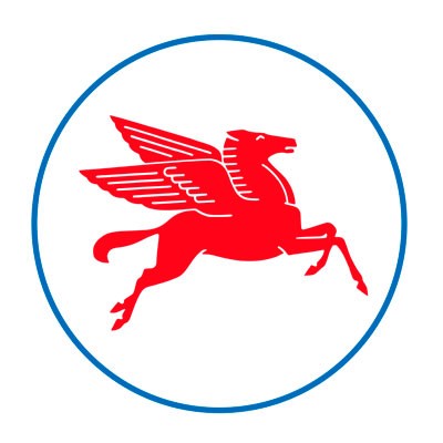
假设Uber(我随意挑选了一个极具数字时代风格的公司作为例证)创建于1909年。显然,它会有一个不同的商业模式,当然不涉及一款智能手机应用,但它涉及将人们有效地从一个地方转移到另一个地方。在那个时代,什么有可能成为这家公司的视觉识别(即它的标志)呢? 或许仅仅是公司的名称。这个很可能更加不讨人喜欢的名称——Uber个人运送公司——以可口可乐的脚本呈现出某种洛可可风格。或许是对其总部进行的一种类似石版画的详尽描述,以表明其工业实力。 在现实中,Uber成立于2009年。到那时,关于标志和品牌视觉识别的其他元素的意义和目的的思考,已经获得长足进展。更为显著的是,自2009年(即iPhone开启智能手机时代的两年之后)以来,这种思考已经发生巨变。 首先需要指出的是,标志不仅仅是公司信头,广告牌或其他促销场所上的名称、图标,或者其他视觉签名。从你的口袋或包里取出那个设备,滑动屏幕——正如你每天或许都会做许多次的那样。无论你去哪里,你现在每天都随身携带数十种品牌图标。著名设计公司Pentagram合伙人迈克尔·比鲁特表示,“人们正在以一种他们此前从未做过的方式,与这些标志进行切切实实地互动。”特别是对于Facebook、Airbnb、Snapchat和Uber等公司来说,这意味着“他们的客户不仅仅与这些品牌,而且与代表这些品牌的标志有一种真正密切的关系。” 现如今,这个现实超越了以数字为中心的公司:无论其产品或服务多么类似,几乎任何一家以消费者为导向的公司,都必须应对一个在某种程度上由APP按钮和Twitter头像定义的沟通环境。这就是品牌标识变得无所不在,深深嵌入我们生活的原因所在。(设计师和客户所说的品牌标识,是指一整套视觉和文字符号,包括标志在内。) |
Suppose Uber —to pick a random example of a distinctly digital-era company—had been founded in 1909. Obviously it would have had a different business model (not involving a smartphone app), but let’s say it involved efficiently moving people from place to place. What, in those days, might have been this firm’s visual identity—its logo? Perhaps just the company name, which would likely have been fussier: the Uber Personal Conveyance Concern, rendered in some rococo style along the lines of Coca-Cola’s script. Or maybe a densely detailed lithograph-style depiction of its headquarters, suggesting industrial might. In reality Uber was founded in 2009, and by then the thinking about the meaning and purpose of a logo and other elements of a brand’s visual identity had evolved quite a bit. More remarkably, that thinking has changed dramatically since 2009, which was two years after the debut of the iPhone ushered in the age of the smartphone. For starters, a logo isn’t just a name or an icon or other visual signature on company letterhead or a billboard or other promotional venue anymore. Take that device out of your pocket or bag and swipe through the screens, as you probably do many times a day anyway. You now carry dozens of brand icons wherever you go. “People are literally, physically interacting with those symbols in a way that they never did,” says Michael Bierut, partner in the prominent design firm Pentagram. For the Facebooks and Airbnbs and Snapchats and Ubers of the world in particular, he continues, that means “their customers are having a really, really intimate sort of relationship not just with those brands, but with the symbols that represent the brands.” And by now, this reality transcends digital-centric companies: Almost any consumer-facing business, however analog its products or services, must reckon with a communication environment partly defined by app buttons and Twitter avatars. This is one reason that brand identities—as designers and their clients refer to the larger set of visual and verbal signifiers that include a logo—have become ubiquitous and embedded in our lives. |
|
与此同时,数字时代让标识系统变得更加动荡。频繁的风格更新,或彻底的品牌改造经常招致不同层级的公众反响——在前几代设计师看来,这些都是不可思议的。导致这一刻的变化最初是逐渐发生,然后似乎突然出现。其结果是,现代企业标识从来没有像现在这样,拥有如此大的利害关系。 视觉传播与拉斯高的洞穴一样古老,符号设计的历史可追溯到代表贵族家庭的饰章,或者代表十字军的十字军徽。在早期的商业环境中,一个独特的标志有助于客户在日益非个人化和广布的市场上区别不同制造商的商品。在工业时代,拜平版印刷术和彩色印刷等新技术所赐,这个基本概念骤然加速。贝斯公司注册于19世纪70年代的红色三角形标记经常被视为第一个商业标志。 |
At the same time, the digital era has helped make the identity systems more volatile, with frequent stylistic updates or outright branding do-overs, often drawing levels of public response that earlier generations of designers would have found unfathomable. The changes that led to this moment happened gradually, and then seemingly all at once. As a result, the stakes for the modern corporate logo have never been higher. Visual communication is as old as the caves of Lascaux, and you can trace the design of symbols to represent groups to aristocratic family crests or the red cross of a Crusader. In early commercial contexts, a unique mark helped customers distinguish one maker’s wares from another in increasingly impersonal and far-flung marketplaces. That basic notion accelerated through the industrial age, influenced by new technologies from lithography to color printing. Bass Ale’s red-triangle mark is often credited as the first commercial logo, trademarked in the 1870s (and famously visible in Édouard Manet’s 1882 painting A Bar at the Folies-Bergère). |

|
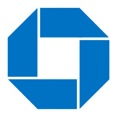
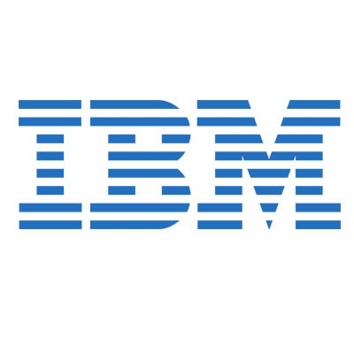
20世纪中期,商标这一相当务实的想法演变为一个更加抽象的“企业标识”概念——将标志和企业视觉传播的其他方面定位为一种既能捕捉品牌的本质,也能为它增添价值的东西。在某种程度上,这是一个更加专业化的设计社区的职能:设计师们用准工业化的严谨态度,执行他们信奉的现代主义美学。那个时代涌现了一大批如今被奉为偶像的标志,其中有许多出自少数几家公司和设计师之手。 雷蒙德·洛威以突破性的工业设计而闻名于世,其客户包括斯塔德贝克公司、希尔斯罗巴克公司、Coldspot冰箱和灰狗公共汽车等。他有一句脍炙人口,旨在说服客户的名言:“好的外观是一件可销售的商品。”这种坚信设计和风格将提升营收的理念,转化为好彩香烟盒、空军一号机身上的图形作品,以及壳牌、埃克森美孚和美国邮政局的徽标。索尔·巴斯为贝尔电话、女童军、美能达和联合航空等机构和组织创造了历久弥新的标志。(值得一提的是,巴斯还是设计电影海报和片头部分的大师。)切尔马耶夫&盖斯马设计公司为美孚石油、美国全国广播公司、美国公共广播公司和大通银行设计了一批持久性的品牌标识。在这个企业设计的黄金时代,最有名的人物或许是保罗·兰德。他为IBM、联合包裹公司、西屋电气和耶鲁大学等机构设计了数十个经典标志。 |
Around the mid-20th century, the rather practical notion of a trademark morphed into a more abstract idea of “corporate identity”—positioning the logo and other aspects of a company’s visual communication as both capturing the essence of a brand and adding value to it. This was partly a function of a more professionalized design community that embraced modernist aesthetics executed with quasi-industrial rigor. And that era produced a startling number of now-iconic logos, many created by a handful of firms and individuals. Raymond Loewy is best known for breakthrough industrial design (Studebakers, the Sears Roebuck and Co. Coldspot refrigerator, the Greyhound bus, and many more)—and for convincing his clients that, as he once put it, “good appearance was a salable commodity.” This belief in the bottom-line payoff of design and style carried over into graphic work from the Lucky Strike box to the livery of Air Force One, as well as logos for Shell, Exxon, and the U.S. Post Office. Saul Bass (also famous for movie-poster and title-sequence work) created lasting logos for Bell Telephone, the Girl Scouts, Minolta, and United Airlines, among others. Chermayeff & Geismar designed durable identities for Mobil, NBC, PBS, Chase, and others. And perhaps the most celebrated figure of this corporate-design golden age, Paul Rand, created scores of logos for the likes of IBM, UPS, Westinghouse, and Yale. |
|
即使在今天,设计师杰瑞·凯珀表示,有许多上述标志仍然“几乎是不可破坏的。”在20世纪80年代早期,凯珀携手巴斯,为AT&T设计了一款旨在取代贝尔电话标志的全球标识。自那以后,他相继为思科公司和信诺集团等企业设计了一些著名标识。那个时代基本上规范了标志设计的思维:独特、难忘、灵活,以及简单。没有层次,没有细线,他们看起来真的像是用白板笔创造的——许多的确是。至少初步的草图是这样。“他笑着说。避免使用一种依赖大量色彩、多色渐变或复杂细节的标志,是有一些实际原因的:它需要显示在一些低质量印刷品上,比如电话薄,报刊分类广告或传真。 |
Even today, many of these logos seem “pretty much indestructible,” says Jerry Kuyper, a designer who worked with Bass on the AT&T globe icon that replaced the Bell logo in the early 1980s and has since designed identities for Cisco, Cigna, and others. That era essentially codified logo-thinking: distinct, memorable, flexible, simple. “There were no gradations, no fine lines; they really looked like they’d been created with a Magic Marker—and many of them were,” he says, laughing. “At least the initial sketches.” There were practical reasons for avoiding a mark that depended on lots of colors, gradients, or intricate detail: It would need to work in low-quality black-and-white printing such as the phone book, classified ads in newspapers, or a fax. |
|
当然,这种背景现在几乎变得无关紧要。加德纳设计公司总裁比尔·加德纳指出,在数字环境中,创建或复制多色渐变或复杂效果是没有任何问题的。(15年来,他经营的网站Logolounge.com一直痴迷于追踪大大小小的企业标识变化和趋势。)正因如此,Instagram当前图标的彩色字段才会出现在你的手机上。 这仅仅是不断变革的技术对标识设计影响的最新例证而已。几十年前,当电脑允许设计师轻松地为标志添加阴影、亮点和维度时,他们确实这样做了。比如,设计师利用3D效果重新修改了兰德设计的扁平化联合包裹标志。从面向印刷品的涂色过程(旨在响应外部的光线)转向面向屏幕的涂色过程(从后面点亮,因此更加强烈),让透明度和色彩渐变这类技巧成为可能。本世纪初期,MSN.com的标志(一只色彩斑斓的蝴蝶)让许多设计师皱起了眉头。他们指出,这个标识实在难以印刷。“但微软声称,‘我们不会印刷它。MSN生活在一个完全数字化的世界中。’”加德纳说。 塞吉·哈维夫是现在被称为切尔马耶夫&盖斯马&哈维夫设计公司的合伙人之一。他说,设计师们仍然用钢笔或铅笔在纸上勾勒黑白色的初步草图。哈维夫声称,自从他的合伙人创建这家公司以来,设计世界已经发生了翻天覆地的变化,但某些基本原则,特别是简单性原则,并没有变化。他们设计的许多标识,尽管在一定程度上受制于20世纪中期的制作条件,但仍然“在数字媒体时代茁壮成长,其应用范围完全超出了他们的预期。”哈维夫说。 尽管如此,他承认,自标识设计的第一个全盛时期(涉及艺术和企业风格精确度的特定融合)以来,这一领域已经发生巨变。彼时,无论某个标志是简单的“文字标志”(像兰德用线条勾勒的IBM标志),还是涉及一个符号(像切尔马耶夫&盖斯马设计公司为大通银行设计的抽象八角形),设计师都会制作一本厚实的“标准手册”,不遗余力地描述这个商标的使用细节。比如,一本IBM标志使用手册具体到打印的字行长度,详细描述了该标志在内部邮件信封上的具体位置。卡内基梅隆大学设计学院教授丹·博亚斯基表示,“这是那个时代的显著特征之一。通过标准手册,你可以了解到使用这个标志和这套标识系统能做什么,不能做什么。” |
Of course such contexts hardly matter now. Creating or reproducing multicolor gradations or complex effects is no problem in the digital environment, observes Bill Gardner, the president of Gardner Design in Wichita. (For 15 years he has operated the popular site Logolounge.com, obsessively tracking business identity changes and trends, large and small.) Thus, for example, the chromatic color field that makes Instagram’s current icon pop on your phone. That’s just the latest manifestation of how changing technology has influenced identity design. A couple of decades ago, when computers allowed designers to easily add shadows and highlights and dimensionality to logos, they did—revising, for instance, Rand’s flat UPS logo with 3D sparkle. A shift from print-oriented color processes (responding to external light) to screen-oriented color (lit from behind, and thus more intense) enabled tricks like transparency and gradients. MSN.com’s early 2000s logo, a butterfly with complicated color overlaps, raised eyebrows among designers at the time, who pointed out how hard it would be to print. “But Microsoft was saying, ‘We’re not going to print it. MSN lives in an entirely digital world,’ ” Gardner says. Sagi Haviv, a partner in the firm now known as Chermayeff & Geismar & Haviv, says designers there still make initial sketches in black and white, with pen or pencil on paper. For all that’s changed since the days when his partners founded the business, he argues, certain fundamentals—simplicity in particular—have not. Many of their logos, shaped partly by the constraints of mid-20th-century production, “thrive in digital media, in applications that they could have never predicted,” Haviv says. Still, he concedes that much has changed since that first heyday of identity design, which involved a particular mix of artistry and corporate-style exactitude. Back then, whether a logo was simply a “wordmark” (like Rand’s IBM, distinctly constructed of stripes) or involved a symbol (like Chermayeff & Geismar’s abstract octagon for Chase), the designer would also produce a thick “standards manual,” painstakingly delineating the precise details of how the mark could be used. For instance, one IBM manual specified, down to the pica, the proper placement of the mark on an internal mail envelope. “That was so part of that era,” says Dan Boyarski, a professor in the School of Design at Carnegie Mellon University. “You went to the standards manual to learn the dos and don’ts with this logo and with this identity system.” |
|
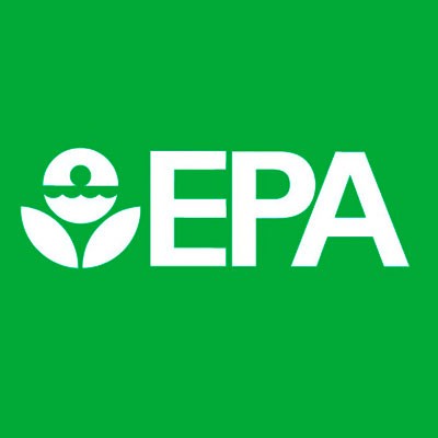
在那个时代,推出一个新标志主要与大规模的后勤工作联系在一起,比如重新涂绘数以千计的卡车或飞机,或者替代横贯东西海岸的加油站上的标志。在这种时代背景下,标准手册或许特别重要。标准当然还在延续,但现在,这些系统通常更加灵活,以适应不断变化的媒体景观。(这些手册已经演变为难得一见的奇珍异宝。事实上,有人最近在众筹网站Kickstarter筹集资金,试图重印切尔马耶夫&盖斯马设计公司在1977年为美国环境保护署制作的长达244页的视觉标准指南。) |
These manuals may have been particularly important in an era when rolling out a new logo was largely associated with massive logistical feats such as repainting thousands of trucks or airplanes, or replacing signage on gas stations from coast to coast. Standards of course persist, but these systems are generally more flexible today to deal with a constantly changing media landscape. (The manuals have become a curiosity. In fact, a recent Kickstarter campaign raised money to reprint the 244-page Chermayeff & Geismar 1977 visual standards guide for the Environmental Protection Agency.) |
|
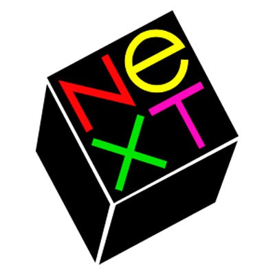
但这些手册或许也是那个时代难以量化的一项特征的副产品:作为一个准萨满教式的问题解决者,设计公司在这样一个客户们刚刚开始理解的新生领域提供专业知识。(IBM总裁小托马斯·J·沃森在1973年发表演讲时声称,‘好的设计是一门好生意’。时至今日,设计师们仍然喜欢引用这句话。)就像医生开具一种诊断结果和治疗方式那样,一些设计师以提供单一解决方案而臭名昭著,尤其是兰德。一位20世纪80年代的客户后来回忆说,“我问他是否会提供几个选项,他说,‘不,我会为你解决你的问题,你付钱给我。如果你想要更多的选项,去找别人谈吧。’”兰德获得了这份工作,以10万美元的酬劳为一家名为Next的个人电脑初创公司设计了一个标志。对此,这位名叫史蒂夫·乔布斯的客户欣然接受。 |
But perhaps the manuals were also a side effect of a harder-to-quantify characteristic of that era: the design agency as quasi-shamanistic problem solver, offering expertise in a nascent field its clients were just beginning to grasp. (“Good design is good business,” IBM president Thomas J. Watson Jr. declared in a 1973 speech that designers still love to reference.) Rand in particular was notorious for presenting a single solution, the way a doctor presents a diagnosis and treatment. “I asked him if he would come up with a few options,” one 1980s client later recalled. “And he said, ‘No, I will solve your problem for you, and you will pay me … If you want options, go talk to other people.’ ” Rand got the job and was paid $100,000 to design a logo for personal-computer startup Next, which that client, Steve Jobs, accepted. |
|
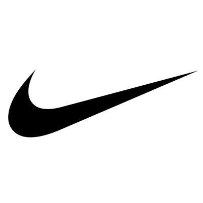
即使在那时,也没有几位设计师能够做到这一点,但可以肯定的是,现在没有人能做到。作为一个对比,不妨看看如今最热门的科技公司Snapchat的标志。创始人自己绘制了一个幽灵符号,据说他仅仅浏览了一下应用商店,并注意到没有多少公司使用黄色,就这样选定了其背景颜色。 一些著名品牌打破了这种严格层级,并为自身标志在数字时代建立了一个不同的未来,耐克就是其中之一。但视觉艺术学院品牌硕士课程负责人,播客Design Matters主持人黛比·米尔曼认为,这真的跟著名的“嗖嗖飞钩”符号没有多大关系。众所周知,第一次看到“嗖嗖飞钩”时,耐克创始人菲尔·奈特的反应相当冷淡。 |
Few designers could get away with that even then, but it’s a fair bet that none could today. As a point of contrast, consider the logo of one of the most talked-about tech companies right now: Snapchat. The founder drew the ghost symbol himself, and reportedly chose its background color by simply scrolling through the app store and noticing there weren’t many companies using yellow. One of the brands credited with breaking down those strict prescriptive hierarchies and setting up a different sort of future for the logo in the digital age is Nike. But this wasn’t really about its famous Swoosh symbol, which Nike founder Phil Knight famously had a lukewarm reaction to the first time he saw it, argues Debbie Millman, chair of the School of Visual Arts’ Masters in Branding program and host of the podcast Design Matters. |
|
“重要的不是这个标记,而是营销。”倘若耐克在过去数十年没有投入数百万美元进行颇具创意的广告宣传活动,“嗖嗖飞钩”恐怕不会获得如此高的认可度。米尔曼继续说道,正是这些营销努力,让“嗖嗖飞钩”获得了商业标志的圣杯:除了通常与公司名称协同产生的“标志锁定”效应之外,它还能够傲然自立,并且仍然是可识别的,仍然有意义。 日益复杂的品牌的强势崛起,大大增强并重塑了现代主义者的一个信念,即一个标志,无论是采用图标还是其他什么形式,只有从它的联系中才能获得意义。切尔马耶夫&盖斯马&哈维夫设计公司的合伙人哈维夫透露称,大通银行董事长“非常讨厌”该公司在上世纪50年代中期设计的蓝色八角形标志。“他说,‘搞什么鬼?这到底是什么意思?”但六个月后,这位董事长穿上了一件袖口印有大通八角形标志的西装。 “它已经成为这家银行的代表,他感受到了一种拥有感。”哈维夫说。这个符号没有任何意义——直至这种联系最终确立。让人们列举一个他们最喜欢的标志,他们总会回答自己惠顾过或者非常尊敬的公司名称,比如耐克、苹果、联邦快递或亚马逊。“他们绝对不会提到安然,即使安然拥有一个由最著名的设计师(其实正是无处不在的保罗·兰德)操刀设计的伟大标志。”哈维夫总结道。 从互联网时代早期开始,数字文化就增强了创造一个独特企业标识——甚至是(或者说,特别是)一个涉及纯抽象符号的企业标识——的挑战和机会。一方面,培训消费者识别一个包含公司名称的文字商标相对更容易;另一方面,当它被压缩到一款应用或社交媒体头像上,一个长度仅为八分之三英寸的位置上时,一个较长的名称或复杂的标志可能难以识别。一些人通过使用一个字标的某个组成部分来解决这道难题——Facebook那个映衬在著名蓝色背景上的小写字母“f”,就是一个耳熟能详的成功案例。但仔细看看你的手机,你可能会注意到很多符号,其中有很多都是很抽象的。“在某种程度上,每一个符号都是旨在为字母表创造一个新字母的尝试。” Pentagram设计公司合伙人比鲁特这样说道。 |
“It’s not the mark,” she says. “It’s the marketing.” The Swoosh would not be so recognizable without millions of dollars of creative firepower poured into advertising and promotion over the decades. That, Millman continues, is what allowed it to attain the holy grail for a commercial symbol: an ability to stand on its own outside the usual “logo lockup” pairing with a company name, yet remain recognizable and meaningful. The rise of increasingly sophisticated branding turbocharged and reinvented something the modernists had believed—a logo, in icon form or otherwise, acquired meaning only from its associations. Haviv, of Chermayeff & Geismar & Haviv, says the chairman of Chase “hated” the blue octagon abstraction the firm designed in the mid-1950s: “He said, ‘Well, what the hell does it mean?’ ” But six months later the chairman was wearing Chase octagon cuff links. “It had become the representation of the bank,” Haviv says, “and he felt a sense of ownership.” The symbol doesn’t mean anything until that association forms. Ask people to name a favorite logo, and they’ll answer with the names of companies they patronize or respect, such as Nike, Apple, FedEx, or Amazon. “They’ll never say Enron,” Haviv concludes, “even though Enron had a great logo, designed by one of the most famous designers.” (The ubiquitous Paul Rand, in fact.) Digital culture, from the early web days on, has heightened both the challenges and opportunities of crafting a distinct corporate identity, even (or perhaps especially) one that involved a purely abstract symbol. On the one hand, it’s easier to train a consumer to recognize a wordmark that includes a company name; on the other, a longer name or complex logo may be hard to recognize or even discern when it’s crunched all the way down to a three-eighths-inch square on an app or a social media avatar. Some can resolve this by using an element of a wordmark—Facebook’s lowercase “f,” on its famous blue background, is familiar enough to pull this off. But if you look at your phone, you’ll probably notice quite a few symbols, many of them pretty abstract. “Every one of those things is an attempt to invent a new letter of the alphabet, in a way,” says Pentagram’s Bierut. |

|
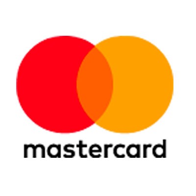
这是一个通常需要花费好几年,甚至几十年的项目,但对于一家庞大或全球性公司来说,它的确能带来可观的回报。2011年,重新设计的星巴克标志取消了所有单词,转而选择其长期使用的美人鱼形象的一个风格化版本;在理论上,这个标志由此得以解放,更容易被世界各地的人们所接受(客户不需要具备阅读西方字母的能力),其联系也不再限于咖啡。Pentagram最近帮助万事达更新标志,将公司名称移至著名的互锁圈之下,为在“标志锁定”之外使用这个符号开启了新的可能性。 |
This is a project that normally takes years, if not decades, but it also has distinct payoffs for expansive or global businesses. Starbucks’ most recent redesign, in 2011, dropped all words from its logo in favor of a more stylized version of its long-standing mermaid figure; in theory, that frees the mark up to work more easily anywhere in the world—customers don’t need to be able to read Western letters—with associations no longer limited to coffee. Pentagram’s recent update of Mastercard moved the company name off and below its familiar interlocking circles, opening up possibilities for using that symbol outside the lockup. |
|
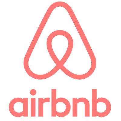
鉴于现在只有如此多的抽象形状和颜色供设计师使用,正如比鲁特所说,有种感觉似乎是,“你可以随意提供这些东西。”他提到Airbnb在2015年重新设计的标志,许多人在社交媒体上嘲讽它像女性生殖器。“我不记得他们曾经说过它应该像什么。我想他们是说,‘这是我们所代表的价值观,从现在开始,这就是陪伴我们持续前行,不断促进这些价值观的旗帜。’在这面旗帜上,它几乎可以是任何东西。” |
Given the reality that there are only so many abstract shapes and colors to work with, it can feel almost as if “you could hand out these things at random,” as Bierut puts it. He mentions Airbnb’s redesign in 2015, which many people mocked on social media for resembling genitalia. “I don’t remember them ever saying that was supposed to look like something,” he says. “I think they said, ‘Here are the values we stand for, and from now on this is the flag under which we will march on our way to promote those values.’ It could almost be anything on the flag.” |
|
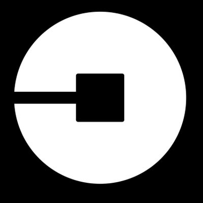
数字技术已经为企业标识的演变过程带来了新的参与者:人群。那些现代主义设计巨匠从来没有必要应对互联网点燃的强烈反应,这种抵制有可能将一款重新设计的标志令人好奇地转变为一场类似流行文化事件的运动。比如,没有哪个品牌希望经历果汁品牌Tropicana在2009年遭遇的无妄之灾。正如该公司的设计师当时所言,为了将这个果汁品牌“演变到一个更加现代化的状态,”Tropicana放弃了长期使用的标志——“一个插有吸管的橙汁”,转而使用一个盛放在玻璃杯中,并使用无衬线字体,有点抽象的果汁图像。投诉电邮不断涌入,销售额下降了20%,那个不够现代的标志被迅速恢复。一年后,Gap收回了一个几天前刚刚宣布,就立刻在Facebook和Twitter上招致漫天嘲讽的新标志。 现在,任何一家有意推出新标志的公司都知道,新设计将被广泛审查,尤其是像Uber这类生存在数字世界的公司。Uber设计、产品和品牌总监沙林·阿明表示,“人们与他们的手机之间存在一种私人关系。“在家中的主屏幕或第二块屏幕上放置东西,几乎就像在他们家摆放家具一样。有人突然闯入家中,要改变沙发的位置。” 成立近8年以来,Uber已经使用了好几个标志,主要是对字母“U”采用不同的处理方式。但该公司在2016年推出的标识计划,旨在设计“一种更适合未来10年、15年的标志。”阿明说。它基本上是一个圆圈内的小矩形,两个几何元素通过一条细线连接在一起。该公司希望,这个纯粹而简单的符号将在U字形没有引起共鸣的全球市场上获得奇效。 不同于上世纪中叶,由一个外部机构提供决定性解决方案的设计界场景,Uber采用了硅谷科技公司尤为青睐的一种处理方式:一个漫长的迭代过程,其中穿插深入的用户研究,并从内部发起。“我们实践和呼吸这个品牌。”阿明如是说道。他解释说,Uber的标志是连接比特和原子这一内部概念的延伸:矩形是比特,圆圈是物理世界。 有没有用户理解其深意呢?这可能是一个错误的问题。阿明欣然认同的一个观点是,新标志的命运将取决于随着时间的推移,它将被赋予何种意义。就目前而言,Uber代表的意义(富有远见的便利,抑或漫不经心的残酷)或许值得商榷,但这家企业的未来并不取决于它的标志。正如1959年或1909年的情形一样,事实恰恰相反。 |
Digital technology has brought something else to the corporate-identity process: the crowd. Those modernist design giants never had to contend with the kind of Internet-fueled backlash that can turn a redesign into something curiously close to a pop culture event. No brand, for instance, wants to endure the Tropicana debacle of 2009. In an attempt to “evolve” the juice brand “into a more current or modern state,” as the company’s designer put it at the time, a redesign dropped Tropicana’s longtime orange-with-a-straw-in-it logo in favor of a somewhat abstract image of juice in a glass and a sans serif font. Complaint emails poured in, sales plunged 20%, and the un-modern logo was promptly restored. A year later, Gap withdrew a planned redesign just days after announcing it, when it was roasted on Facebook and Twitter. (As Vanity Fair put it at the time, “The logo passed after a brief and ignominious battle with stage IV banality.”) By now any company pushing a new logo knows that the design will be widely scrutinized. And that may be acutely true for a digital-dependent company like Uber. “There’s a personal relationship that people have with their phones,” says Shalin Amin, Uber’s director of design, product, and brand. “What they put on their home screen vs. the second screen—it’s almost like somebody’s house, where you place your furniture. And all of a sudden somebody comes in to change your couch.” In its eight or so years of existence, Uber has cycled through a couple of logos, essentially varying treatments of the letter “U.” But the identity scheme it unveiled in 2016 is meant to be “something that better suited us for the next 10, 15 years,” Amin says. Basically it’s a small rectangle within a circle, the two geometric elements connected by a thin line, a pure and simple symbol the company hopes will work in global markets where the U letterform has no resonance. In contrast to the mid-century scenario in which an outside agency presents a solution with a decisive “ta-da,” Uber followed what has become a more typical approach for Silicon Valley tech-centric firms in particular: a long, iterative process, spiked with extensive user research, and led from within. “We live and breathe the brand,” Amin says. The Uber glyph, he explains, is an extension of the internal concept of linking bits and atoms: The rectangle is a bit; the circle is the physical world. Does any user get that? That’s probably the wrong question. Amin readily agrees that the new mark’s fate will depend on how it’s filled with meaning over time. What Uber stands for (visionary convenience or blithe ruthlessness) may be up for debate at the moment, but the business’s future does not depend on the logo. As in 1959, or 1909, it’s the other way around. |
|
重新设计更多地由公司内部驱动这一转变,反映了硅谷的一大趋势。旧金山特纳·达克沃斯设计公司创始人大卫·特纳表示,“就这些企业的实际运作方式而言,设计具有至关重要的意义。”这家设计公司创造了现已延续20年的亚马逊标志,并且帮助更新了诸如可口可乐和李维斯这类偶像级品牌的标志。“他们建立了非常强大的内部设计团队,并且有能力为这些设计师支付高额薪水。我知道这一点,因为他们总是企图挖我的人!” 特纳指出,更加纯粹的数字公司实际上可以比以往任何时候都更容易修改其标志。如果你真的依赖一款特定的APP,哪怕其视觉呈现方式发生根本性变化(比如Instagram),你也会迅速适应。这可能反映了一种更为重大的转变:许多科技公司不仅仅是以设计为中心,而是以互动-设计为中心。他们高度专注于塑造我们与计算机、互联网和移动应用互动方式的图形用户界面。 在这样一个信息-设计环境中,清晰度是最重要的诉求。例如,几年前,苹果公司彻底修改了其移动操作系统中的图标,以消除模仿类比世界的“拟物化”符号——比如指代“报亭”的木架,或指代“笔记”的黄色便笺簿——转而使用更加平坦、更加简单的图像。你可以看到这种转变对Instagram标志的影响:其标志不再是对一部快速照相机的详尽描述,而是一个使用至今的抽象版本。 特纳表示,将互动-设计思维应用到标识设计,会产生一批可能“高度合乎逻辑,非常精简的”标志。“但我认为,正在开始发生的,是你逐渐失去个性。你正在失去这个品牌的内涵,而这种内涵与人类的情感是相通的。”然而,你可以看到为什么互动-设计趋势会影响现在的标志:我们与它们互动。对于一家以数字为中心的公司来说,一个简单、清晰易记的符号不仅仅是一个有价值的品牌元素。它其实是带有功能性的。 在21世纪,数字环境并不是唯一一个被标志渗透的地方。我们现在期望咖啡店、独立乐队、微型啤酒厂、食品卡车或一家由两人组成的科技创业公司都拥有一个很酷的视觉识别。不仅仅是在美国。哈维夫表示,在他的合伙人参与领导的标志革命爆发整整60年之后,现在很难构想一个真正原创的标志。每当他的设计团队将一个新创意提交给法律部,以供后者在全球范围内搜索类似商标时,他们总是被提醒这一点,因为律师们总能发现一些可能存在的先例。“对于任何设计师来说,这都是一个令人谦卑的时刻。”他说。 几年前,Logolounge.com创始人加德纳表示,设计师在厚厚的印刷年度综合报告中研究彼此的作品。今天,通过设计网站或社交媒体,一位大牌设计师可以看到地球另一端某位设计新秀最新发布的标识创新,反之亦然。仅Logolounge一家网站的虚拟图书馆现在就能提供超过26.5万个标志。加德纳指出,“现在很难说‘这种设计方式是一个趋势,’因为它会迅速地成为老古董。”正如视觉艺术学院的米尔曼所言,由于标识“倾向于更快地布满尘埃,”企业面临更大的诱惑去更快地改变和更新品牌标识。这相悖于一项有助于我们观察任何特定设计是否真正具有偶像地位的元素:时间的流逝。 但并不仅仅是设计师及其客户看到比以往任何时候都更多的标志和品牌设计,然后与之互动。我们这些圈外人也是如此。米尔曼指出,作为现代标识设计或许最令人惊奇的进展之一,越来越多的普通人开始学习自己设计标志——“使用专业设计人士确立的品牌设计信条,为运动创造符号。”她列举的例子包括“黑人的命也是命”,以及在巴黎遭受恐怖袭击之后迅速流行的“为和平祈祷”符号,甚至还包括粉红色的猫咪帽——在唐纳德·特朗普就职后全美各地爆发的妇女游行活动中,这种旨在抨击当选总统侮辱女性言论的帽子赚足了眼球。 米尔曼表示,“这些都是标志,它们是传播运动的有力符号,它们将拥有共同价值观、愿景和使命的人们聚集在一起。所有这些都是品牌宣传。”也许这就像非常频繁地听另一种语言之后,你也开始使用它。“无论这是好事还是坏事,它只是我们这个时代的一个后果。”事实上,她认为猫咪帽是过去一年最有力的“品牌”象征。“这是一种新形状,新形式,它正在利用一种颜色,没有使用任何语言。”米尔曼这样说道。“这是一个堪称完美的标志。”(财富中文网) 原文刊载于2017年6月15日出刊的《财富》杂志。 译者:Kevin |
The shift to more internally driven redesigns is a reflection of a broader trend in Silicon Valley. “Design is so fundamental to the way these businesses actually operate,” says David Turner, cofounder of San Francisco design agency Turner Duckworth, which created Amazon’s now 20-year-old logo, and has updated the identities of brands as venerable as Coca-Cola and Levi’s. “They build really robust internal design teams. And they can pay them a lot of money. I know, because they’re always trying to poach my people!” Turner points out that more purely digital companies can actually revise their logo schemes much more easily than ever. If you really rely on a particular app, and its visual presentation changes radically (as, say, Instagram’s did), you’ll soon adjust. And this may reflect a more significant shift: Many tech companies aren’t just design-centric, they’re interaction-design-centric. They focus heavily on the graphical user interfaces that shape the way we interact with computers, the Internet, mobile apps. In an information-design environment, clarity rules. A few years ago, for instance, Apple thoroughly revised the icons in its mobile operating system to do away with “skeuomorphs”—symbols that mimicked analog-world contexts, such a wood-shelf “newsstand” or a yellow pad for “notes”—in favor of flatter and simpler images. You can see the influence of this shift in Instagram’s logo, which switched from a fairly detailed depiction of an instant camera to the more abstract version it uses today. Applying interaction-design thinking to identity design results in logos that can be “highly logical, very stripped down,” Turner says. “But I think what’s starting to happen is you’re starting to lose personality. You’re losing what brands are all about, which is connecting to human emotion.” And yet, you can see why interaction-design trends would influence logos now: We interact with them. For a digital-centric company, a simple, clear, easy-to-memorize symbol isn’t just a potentially valuable branding element. It’s actually functional. The digital environment is not the only place soaked in logos in the 21st century. We now expect every coffee shop, indie band, microbrewery, food truck, or two-person tech startup to have a cool visual identity. And that’s not just in the U.S. Sixty years after the logo revolution his partners helped lead, Haviv says, it’s harder to come up with something truly original. His firm is reminded of this every time it turns a new creation over to the legal department to search for similar marks around the globe, and the lawyers find a slew of possible precedents. “It’s a humbling moment, for any designer,” he says. Years ago, says Logolounge founder Gardner, designers studied one another’s work in thick printed annual roundups. Today, through design sites or social media, a big-shot designer can see the latest identity innovation from an up-and-comer on the other side of the planet, and vice versa. Logolounge alone now offers a virtual library of more than 265,000 logos. “It’s hard to even say ‘This is a trend,’ ” Gardner continues, “because things become old hat so quickly.” And because identities “tend to look dusty faster,” as SVA’s Millman puts it, there’s even more temptation to change, update, or revise them more quickly. This cuts against one of the elements that helps us see any particular design as truly iconic: the passage of time. But it’s not just designers and their clients who see and interact with more logos and brand design than ever. It’s the rest of us too. And in what may be the most surprising development in modern identity design, Millman suggests we’re increasingly learning how to do it ourselves— “using the tenets of branding that have been established in professional circles, to create symbols for movements.” She points to examples like Black Lives Matter, the Peace for Paris symbol that went viral after terrorist attacks in that city, and even the pink pussy hat, which got a lot of attention for its prominence in the women’s marches that occurred after Donald Trump’s inauguration. “Those are all logos,” she argues. “They’re symbols that telegraph a movement, that bring people together who share values and a vision and a mission. And that’s all branding.” Perhaps this is like hearing another language so frequently you start to pick it up by osmosis. “Whether it’s a good thing or a bad thing,” Millman says, “it’s just a consequence of our times.” In fact, she names the pussy hat as the most potent “brand” symbol of the past year. “It was a new shape. It was a new form. It was utilizing a color. It didn’t have any language,” she says. “It’s sort of a perfect mark.” A version of this article appears in the June 15, 2017 issue of Fortune with the headline "The Most Important Quarter-Inch in Business." |