

百事可乐耗巨资重塑品牌背后的逻辑
SASHA ROGELBERG
2024-05-27
在声势浩大的品牌重塑过程中,不管有多少人嘲讽,对百事来说都是好事。
 文本设置
文本设置
 Plus(0条)

全宇宙最高级的艺术作品阵容包括:反映自然和数学“非凡之美”的黄金比例;莱昂纳多·达·芬奇的《蒙娜丽莎》以及展现完美人体结构的《维特鲁威人》,当然,还有百事标识。
至少,这家饮料巨头2008年长达27页的标志更改设计报告是这样介绍的。在该报告中,设计机构阿内尔集团(Arnell Group)全面地讲述了百事品牌重塑背后的理由:首先是确立彰显创新的愿望,然后回顾了艺术的演变,从毕达哥拉斯的“空间和谐”一直讲到文艺复兴艺术,最后将这一完美的新设计归结为:反映了地球引力下阳光变化的轨迹。最终的标志将凸显“百事的引力”。
报告中写道:“百事的特质一直在与时俱进。真与简的理念始终贯穿百事的历史,以一种永恒、明了的方式讲述着品牌的故事。”
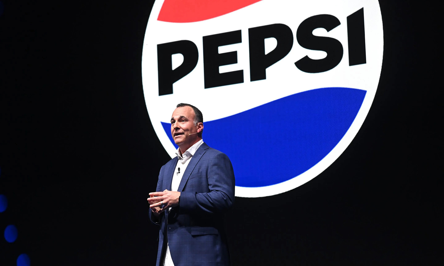
品牌大刀阔斧的重塑带来了什么?百事依然采用了红白蓝相间的圆形标志,只不过其中心白色条纹起伏的角度较之前的标志略有不同。
即使在做出标识调整15年之后——2024年3月份的全球品牌重塑又让白色回归其中心最初的波浪形空间——2008年的设计报告在社交媒体上疯传,也让人们着实震惊了一把,TikTok上的讨论满天飞,而且人们还纷纷利用图形计算器进行再创作。不过,高达100万美元的设计费用更是让百事2008年标识更换的荒唐理由雪上加霜。
一位Reddit用户在评价2008年的标志重塑时表示:“这是赤裸裸的讽刺!还什么百事的引力?!”
以图形设计师(接受过大学教育)“自居”的艾米丽·祖盖称,百事看似荒唐的品牌重塑实际上是一种非常常见的做法。艾米丽在她的TikTok账号上夸张地再造了百事的标识,该账号有430万粉丝。
她对《财富》杂志说:“当这些公司花重金重新设计标志时,即便只是小事一桩,但他们依然觉得需要为其正名,甚至给自己一个交代,有时候就是通过上面这种报告,将其与蒙娜丽莎进行对比,来说明这个钱花得值。”
不过,南卫理公会大学考克斯商学院(Southern Methodist University’s Cox School of Business)营销教授温基·尚卡尔称,有关百事老标识的持续讨论与公司现代营销理念息息相关。百事此前的品牌重塑举措可能会遭到人们的调侃,但随之而来的业务要素和行业趋势却是实打实的。
尚卡尔表示:“当各大品牌的销售增长不及预期时,它们就会考虑开展品牌重塑。以百事为例,碳酸饮料,尤其是气泡饮料,已经处于下行通道很长时间,并非是几年前才出现的情形。”
百事2008年的品牌重塑也不例外:那一年10月,也就是阿内尔集团向百事提交新标志设计文稿后的两个月,百事报出了令人失望的营收业绩,原因在于经济疲软导致的饮品销量下滑。公司宣布裁员3300人,占其员工总数的1.8%。
百事2023年进行品牌重塑的出发点也十分明确。
尽管营收好于预期,但美国的销量停滞不前,因为消费者对于公司的涨价并不买单。值得一提的是,Z一代消费者并不喜欢含糖汽水,而是偏好更加健康的替代起泡饮品。为了吸引年轻消费者,百事已聘请“冰香料”Ice Spice这样的饶舌歌手来宣传其柠檬青柠苏打水,并推出了新的起泡水产品线。同样,百事的新标志也在通过其怀旧风格来吸引Z一代的注意力。
公司在一份声明中向《财富》透露:“多年来,百事一直在重新构思和设计自家标志,作为一个与时俱进、永不过时的品牌,我们一直在升级我们的外观和质感,而且粉丝和消费者也一直在伴随着我们成长。2008年推出的视觉标识在品牌过去的14年中大获成功。尽管如此,百事在2023年迈入了新阶段。”
阿内尔集团并未回复《财富》的置评请求。
坎坷的重塑历程
百事集团的营销重塑并不总是能达到达·芬奇级别的高度。在2008年推出新百事标志的同时,母公司还重塑了其纯果乐(Tropicana)品牌。这个果汁品牌在1998-2021年是百事的子公司。为了迎合大杯橙汁的版面设计,它拿掉了正面居中的文字标识。这个设计在推出初期遭到了社交媒体的厌弃。
《纽约时报》(New York Times)在2009年转载了一名愤怒客户的邮件内容:“这些包装设计师真的会去购买橙汁吗?因为我得去买,新的包装太差劲了。”
然而,真正促使公司在重新设计后换回其原标志的并非是线上的热议,而是换标后一个月公司暴跌20%的销量。
百事的错误与可口可乐1985年的“新可乐”举措如出一辙。当时,后者宣布将首次更改其使用了近100年的饮品配方。对此反感的消费者给公司热线打去了3.16万个电话。不过,这种愤怒也巩固了可口可乐的地位,用其博客的话来讲,可口可乐“明显不仅仅只是一款软饮”。
事实上,无效的大型营销举措不胜枚举。百事在2017年犯下了自己最大的线上错误。当时,公司发布了一则广告,肯达尔·詹娜将一罐百事可乐递给了一名警官,背景是欢呼和充满笑容的抗议者。这则广告借鉴了抗议警察暴力执法的“黑命贵”运动的影像,被普遍认为不合时宜。公司随后进行了道歉,但广告已在线上疯狂传播。
百事当时表示:“百事曾尝试向全球传递团结、和平和理解的信息。很明显,此举未能达到预期效果,并以道歉收场。”
尚卡尔认为,各大公司应谨慎应对网络调侃:“像百事这样的消费品,如果人们嘲弄过了头,并开始伤害现有消费者,问题可能会接踵而至。”
花这个钱值吗?
尚卡尔表示,尽管百事2017年的广告带来了强烈的负面影响,但有关百事原标志的持续热议倒不大可能被视作对公司的威胁。
有一句老话,“任何宣传都是好宣传”。尚卡尔认为,在声势浩大的品牌重塑过程中,不管有多少人嘲讽,对百事来说都是好事。确实,社交媒体改变了营销规则,而各大品牌也在通过Z一代荒诞的幽默,让其产品更具吸引力。Twitter的热议让 Josh Cellars红酒和Cerveza Cristal啤酒等饮品实际上获得了免费营销。TikTok播主祖盖是这一浪潮的亲身经历者。她对一些大品牌标志进行了刻意的庸俗化再制作,而这些作品被麦当劳、Tinder和美国职业橄榄球大联盟(NFL)等品牌转载并用作社交媒体资料页图片。
她说:“人们对此是喜闻乐见,因为它告诉人们,这些品牌并非是高高在上的,至少在TikTok上是如此。”
值得一提的是,对百事这个与可口可乐打了几十年的品牌来说,对品牌标志的热议或将提升人们对品牌的忠诚度。
祖盖表示:“很多时候,人们将标志和品牌视作自己十分珍视的事物,他们几乎觉得自己在一定程度上是标志外观或品牌本身的所有者。我觉得,当明确提及标志和品牌重塑时,人们会变得非常敏感。”
百事的粉丝们已经昭告天下,无论百事的品牌重塑是好是坏,他们都会忠于自己对可乐的选择。就像一位Reddit用户说的那样:“非常不幸的是,每当我路过饮品货架的时候,百事的引力都会让我无法自拔。”(财富中文网)
译者:冯丰
审校:夏林
全宇宙最高级的艺术作品阵容包括:反映自然和数学“非凡之美”的黄金比例;莱昂纳多·达·芬奇的《蒙娜丽莎》以及展现完美人体结构的《维特鲁威人》,当然,还有百事标识。
至少,这家饮料巨头2008年长达27页的标志更改设计报告是这样介绍的。在该报告中,设计机构阿内尔集团(Arnell Group)全面地讲述了百事品牌重塑背后的理由:首先是确立彰显创新的愿望,然后回顾了艺术的演变,从毕达哥拉斯的“空间和谐”一直讲到文艺复兴艺术,最后将这一完美的新设计归结为:反映了地球引力下阳光变化的轨迹。最终的标志将凸显“百事的引力”。
报告中写道:“百事的特质一直在与时俱进。真与简的理念始终贯穿百事的历史,以一种永恒、明了的方式讲述着品牌的故事。”
品牌大刀阔斧的重塑带来了什么?百事依然采用了红白蓝相间的圆形标志,只不过其中心白色条纹起伏的角度较之前的标志略有不同。
即使在做出标识调整15年之后——2024年3月份的全球品牌重塑又让白色回归其中心最初的波浪形空间——2008年的设计报告在社交媒体上疯传,也让人们着实震惊了一把,TikTok上的讨论满天飞,而且人们还纷纷利用图形计算器进行再创作。不过,高达100万美元的设计费用更是让百事2008年标识更换的荒唐理由雪上加霜。
一位Reddit用户在评价2008年的标志重塑时表示:“这是赤裸裸的讽刺!还什么百事的引力?!”
以图形设计师(接受过大学教育)“自居”的艾米丽·祖盖称,百事看似荒唐的品牌重塑实际上是一种非常常见的做法。艾米丽在她的TikTok账号上夸张地再造了百事的标识,该账号有430万粉丝。
她对《财富》杂志说:“当这些公司花重金重新设计标志时,即便只是小事一桩,但他们依然觉得需要为其正名,甚至给自己一个交代,有时候就是通过上面这种报告,将其与蒙娜丽莎进行对比,来说明这个钱花得值。”
不过,南卫理公会大学考克斯商学院(Southern Methodist University’s Cox School of Business)营销教授温基·尚卡尔称,有关百事老标识的持续讨论与公司现代营销理念息息相关。百事此前的品牌重塑举措可能会遭到人们的调侃,但随之而来的业务要素和行业趋势却是实打实的。
尚卡尔表示:“当各大品牌的销售增长不及预期时,它们就会考虑开展品牌重塑。以百事为例,碳酸饮料,尤其是气泡饮料,已经处于下行通道很长时间,并非是几年前才出现的情形。”
百事2008年的品牌重塑也不例外:那一年10月,也就是阿内尔集团向百事提交新标志设计文稿后的两个月,百事报出了令人失望的营收业绩,原因在于经济疲软导致的饮品销量下滑。公司宣布裁员3300人,占其员工总数的1.8%。
百事2023年进行品牌重塑的出发点也十分明确。
尽管营收好于预期,但美国的销量停滞不前,因为消费者对于公司的涨价并不买单。值得一提的是,Z一代消费者并不喜欢含糖汽水,而是偏好更加健康的替代起泡饮品。为了吸引年轻消费者,百事已聘请“冰香料”Ice Spice这样的饶舌歌手来宣传其柠檬青柠苏打水,并推出了新的起泡水产品线。同样,百事的新标志也在通过其怀旧风格来吸引Z一代的注意力。
公司在一份声明中向《财富》透露:“多年来,百事一直在重新构思和设计自家标志,作为一个与时俱进、永不过时的品牌,我们一直在升级我们的外观和质感,而且粉丝和消费者也一直在伴随着我们成长。2008年推出的视觉标识在品牌过去的14年中大获成功。尽管如此,百事在2023年迈入了新阶段。”
阿内尔集团并未回复《财富》的置评请求。
坎坷的重塑历程
百事集团的营销重塑并不总是能达到达·芬奇级别的高度。在2008年推出新百事标志的同时,母公司还重塑了其纯果乐(Tropicana)品牌。这个果汁品牌在1998-2021年是百事的子公司。为了迎合大杯橙汁的版面设计,它拿掉了正面居中的文字标识。这个设计在推出初期遭到了社交媒体的厌弃。
《纽约时报》(New York Times)在2009年转载了一名愤怒客户的邮件内容:“这些包装设计师真的会去购买橙汁吗?因为我得去买,新的包装太差劲了。”
然而,真正促使公司在重新设计后换回其原标志的并非是线上的热议,而是换标后一个月公司暴跌20%的销量。
百事的错误与可口可乐1985年的“新可乐”举措如出一辙。当时,后者宣布将首次更改其使用了近100年的饮品配方。对此反感的消费者给公司热线打去了3.16万个电话。不过,这种愤怒也巩固了可口可乐的地位,用其博客的话来讲,可口可乐“明显不仅仅只是一款软饮”。
事实上,无效的大型营销举措不胜枚举。百事在2017年犯下了自己最大的线上错误。当时,公司发布了一则广告,肯达尔·詹娜将一罐百事可乐递给了一名警官,背景是欢呼和充满笑容的抗议者。这则广告借鉴了抗议警察暴力执法的“黑命贵”运动的影像,被普遍认为不合时宜。公司随后进行了道歉,但广告已在线上疯狂传播。
百事当时表示:“百事曾尝试向全球传递团结、和平和理解的信息。很明显,此举未能达到预期效果,并以道歉收场。”
尚卡尔认为,各大公司应谨慎应对网络调侃:“像百事这样的消费品,如果人们嘲弄过了头,并开始伤害现有消费者,问题可能会接踵而至。”
花这个钱值吗?
尚卡尔表示,尽管百事2017年的广告带来了强烈的负面影响,但有关百事原标志的持续热议倒不大可能被视作对公司的威胁。
有一句老话,“任何宣传都是好宣传”。尚卡尔认为,在声势浩大的品牌重塑过程中,不管有多少人嘲讽,对百事来说都是好事。确实,社交媒体改变了营销规则,而各大品牌也在通过Z一代荒诞的幽默,让其产品更具吸引力。Twitter的热议让 Josh Cellars红酒和Cerveza Cristal啤酒等饮品实际上获得了免费营销。TikTok播主祖盖是这一浪潮的亲身经历者。她对一些大品牌标志进行了刻意的庸俗化再制作,而这些作品被麦当劳、Tinder和美国职业橄榄球大联盟(NFL)等品牌转载并用作社交媒体资料页图片。
她说:“人们对此是喜闻乐见,因为它告诉人们,这些品牌并非是高高在上的,至少在TikTok上是如此。”
值得一提的是,对百事这个与可口可乐打了几十年的品牌来说,对品牌标志的热议或将提升人们对品牌的忠诚度。
祖盖表示:“很多时候,人们将标志和品牌视作自己十分珍视的事物,他们几乎觉得自己在一定程度上是标志外观或品牌本身的所有者。我觉得,当明确提及标志和品牌重塑时,人们会变得非常敏感。”
百事的粉丝们已经昭告天下,无论百事的品牌重塑是好是坏,他们都会忠于自己对可乐的选择。就像一位Reddit用户说的那样:“非常不幸的是,每当我路过饮品货架的时候,百事的引力都会让我无法自拔。”(财富中文网)
译者:冯丰
审校:夏林
The universe’s highest echelon of art contains the following: the golden ratio, reflecting the “divine” in both nature and mathematics; Leonardo Da Vinci’s Mona Lisa and the Vetruvian Man, demonstrating the ideal human physiology—and, of course, the Pepsi logo.
At least, this is the story told by a 27-page design document of a 2008 brand refresh from the beverage juggernaut. In the document, design agency the Arnell Group thoroughly outlined the rationale behind Pepsi’s brand refresh: first establishing the desire to show innovation, then reviewing the evolution of art from Pythagorean “spatial harmonies” to Renaissance art, until deriving the perfect new design that reflects the path of the Sun’s light in Earth’s gravitational pull. The final logo would illustrate the “Gravitational Pull of Pepsi.”
“The Pepsi ethos has evolved over time,” the document said. “The vocabulary of truth and simplicity is a reoccurring phenomena in the brand’s history. It communicates the brand in a timeless manner and with an expression of clarity.”
The result of the radical rebrand? Pepsi’s same red, white, and blue circular logo, but with its white center stripe undulating at a slightly different angle than its predecessor.
Even 15 years after that change—and a March 2024 global rebranding that returned the white center to its original squiggly shape—the 2008 design document circulates around social media, prompting viral TikToks, do-it-yourself recreations on graphing calculators, and eliciting genuine shock. Piling onto the absurdity of the rationale accompanying Pepsi’s 2008 logo is the redesign’s $1 million price tag.
“Surely this is satire! Pepsi gravitational pull?!” one Reddit user wrote about the 2008 redesign.
According to Emily Zugay, a “self-proclaimed” (and university-trained) graphic designer who parodies company logos on her TikTok with 4.3 million followers, Pepsi’s seemingly absurd brand refresh is actually pretty common practice.
“When these companies are spending thousands of dollars on these redesigns—even if it’s something that could take five minutes—they feel like they need to justify it, even to themselves, sometimes with a document like that: comparing it to the Mona Lisa to show this was worth the money,” she told Fortune.
But the enduring chatter around Pepsi’s old logo is at the nexus of the company’s modern marketing philosophy, according to Venky Shankar, professor of marketing at Southern Methodist University’s Cox School of Business who worked with Pepsi to design a global forecast system for the company. The discourse around Pepsi’s previous rebranding may be in jest, but the precipitating business factors and industry trends are very real.
“All brands look for a refresh when their sales are not growing as fast as they expected to,” Shankar said. “In this case, carbonated beverages, particularly sodas, have been witnessing a downward trend for a very long time, not just the last few years alone.”
Pepsi’s 2008 rebrand was no exception: In October that year, two months after the Arnell Group submitted its redesign document to the company, Pepsi reported disappointing earnings due to poor drink sales, a result of a weakened economy, and announced plans to lay off 3,300 workers, about 1.8% of its workforce.
The impetus for Pepsi’s 2023 redesign is also clear.
Despite better-than-expected revenue, sales have been hindered in the U.S. by consumers thrown off by the company’s price increases. Gen Z consumers in particular have also lost their taste for sugary soda, instead preferring healthier fizzy alternatives. Pepsi has tapped rappers like Ice Spice to push its lemon-lime soda and launched a new line of bubly sparkling water in a bid for young consumers. Pepsi’s new logo makes a similar appeal to Gen Z with its retro vibes.
“Pepsi has constantly reimagined and reinvented our logo over the years—as a brand that is both timely and timeless we’ve evolved our look and feel just as our fans and consumers have evolved along with us,” the company told Fortune in a statement. “The visual identity introduced in 2008 has been very successful for us over the past 14 years of the brand. That said, in 2023 we introduced the next era of Pepsi.”
Arnell Group did not respond to Fortune’s request for comment.
Rebrand stumbles
PepsiCo’s marketing refreshes haven’t always reflected Da Vinci-caliber genius. In tandem with the rollout of its new Pepsi logo in the late aughts, the parent company also refreshed its Tropicana branding. The juice brand, a subsidiary of Pepsi from 1998 to 2021, removed its front-and-center logo in favor of a tall glass of orange juice. Social media, then in its early days, hated the design.
“Do any of these package-design people actually shop for orange juice?” one angry customer wrote over email, the New York Times reported in 2009. “Because I do, and the new cartons stink.”
But it wasn’t an online uproar that prompted the company to revert back to its original logo shortly after the redesign. It was the 20% sales plummet that followed the month after.
Pepsi’s misstep had shared flavors with Coca-Cola’s 1985 “New Coke,” when the beverage company announced it would change its drink formula for the first time in almost a century. Consumers revolted, leaving 31,600 calls on the company’s hotline, but the anger also cemented Coca-Cola’s stature, according to its blog, as “obviously more than just a soft drink.”
In fact, plenty of big marketing swings fail to pay off. One of Pepsi’s biggest online blunders came in 2017, when the company aired an ad with protesters laughing and cheering, that concludes with Kendall Jenner passing out a Pepsi can to a police officer. The ad borrowed imagery from the Black Lives Matter movement protesting police brutality and was largely considered tone deaf. The company later apologized, but not before memes of the ad spread widely online.
“Pepsi was trying to project a global message of unity, peace and understanding. Clearly, we missed the mark and apologize,” Pepsi said at the time.
Shankar argued corporations walk a fine line with being made fun of online: “In a consumer product like Pepsi, if people are making too much fun of it and it starts hurting the existing consumers, that could be a problem,” he said.
Was it all worth it?
While Pepsi’s 2017 ad generated enough uproar to have negative consequences, the continued fervent meme-ing of Pepsi’s old logo is not likely to be seen as a threat to the company, Shankar said.
Drawing on the old adage of “any publicity is good publicity,” Shankar believed that in the case of a buzzy rebranding, however mocked it is, means good news for Pepsi. Indeed, social media has changed the marketing game as brands lean into the absurdity of Gen Z humor to get more eyes on their products. Twitter memes have resulted in beverages like Josh Cellars wine and Cerveza Cristal beer essentially receiving free marketing. Zugay, the TikToker, has experienced this phenomenon firsthand. Her intentionally shoddy recreations of big-name logos have been reposted and used as social media profile pictures by brands like McDonald’s, Tinder, and the NFL.
“People really resonate with that and enjoy that,” she said. “Because it shows that brand isn’t untouchable—at least on Tiktok.”
But for Pepsi in particular—which has waged war with Coca-Cola for decades—brand loyalty may have ratcheted up the clamor around the logo.
“A lot of times people view logos and brands as precious to themselves or they almost feel a sense of ownership over the look of a logo or the brand itself, if they’ve been a loyal customer for however long,” Zugay said. “People, I feel like, are very sensitive when it comes to logos and rebrand specifically.”
Pepsi loyalists have already shown that regardless of the reputation the company’s rebrands have, they’ll stay true to their cola of choice. As one Reddit user put it, “When I walk down the drink aisle I unfortunately always succumb to pepsi’s gravitational pull.”
请打开财富Plus APP