
小公司如何塑造大品牌
Laura Entis
2018-04-22
Oatly从一款默默无闻的产品跃升成一种文化现象,离不开几个因素的共同推动。
 文本设置
文本设置
 Plus(0条)

|
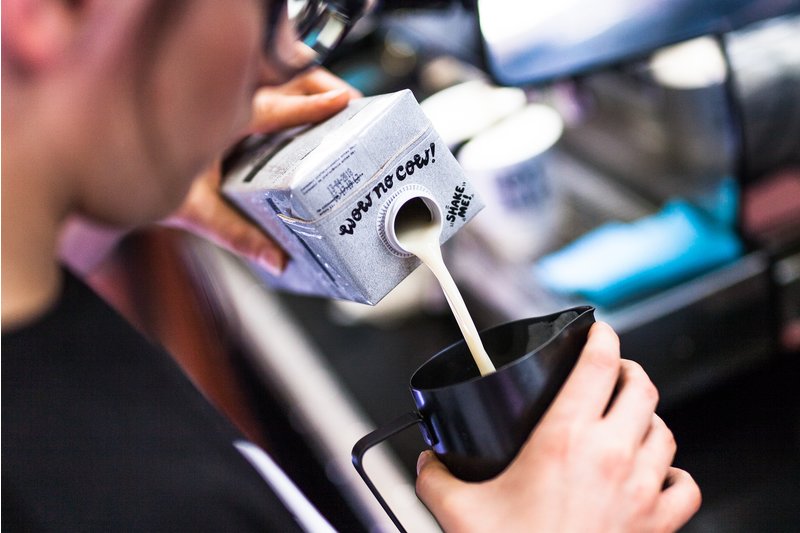
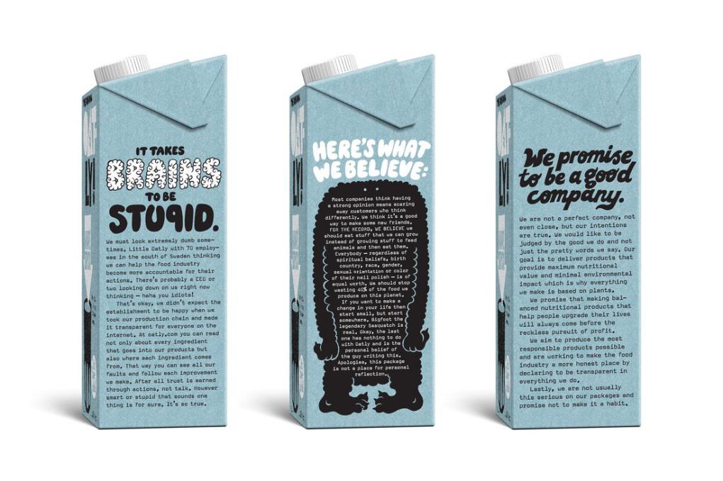
谁没做过一夜成名走上人生巅峰的美梦呢?但有一家名叫Oatly的瑞典燕麦乳公司却真的做到了。这家公司是由一位食品科学专业的教授创立的。此前20多年,它都只是植物饮料行业里一个籍籍无名的小字辈。但从几年前开始,它的知名度突然暴涨,先是在欧洲搞出名堂,随后在美国也火得一塌糊涂。仿佛一夜之间,到处都在谈论这家公司,它甚至还上了《纽约时报》,对于一家2017年年初才登陆美国的公司,它的成绩可以说相当了不起。 Oatly从一款默默无闻的产品跃升成一种文化现象,离不开几个因素的共同推动。首先它的产品味道是相当不错的(醇厚、饱满是消费者对它的常见评价),另外植物奶市场总体上也呈增长态势。但如果该公司五年前没有对品牌进行重塑,恐怕今天知道它的人仍然不会太多。 2013年,该公司将约翰·斯库克拉夫特任命为创意总监,负责为公司品牌形象注入新活力。当时斯库克拉夫特对燕麦乳这种产品一无所知,该公司的产品包装也没有什么打动他的地方。“它没有什么令人兴奋之处,只是让人感到很无趣,跟其他产品没什么区别。”他回忆道。 斯库克拉夫特与Oatly的CEO托尼·彼得森携手瑞典知名营销公司Forsman & Bodenfors,决心重新塑造新的品牌形象。他们认为,公司新的品牌审美应该回归质朴。“我们希望给人造成一种感觉,就是这些产品仿佛是在地下室里包装的一样。总之,我们希望它看起来并不像一个企业的品牌或者Logo”。 包装上的图形是由F&B公司的设计师拉尔斯·埃尔夫曼手绘完成的。包装上的文案则由斯库克拉夫特亲自操刀,最终的包装颇有意识流的风格,同时又真诚而不做作地解释了产品和公司的使命。 在对燕麦乳进行描述后,包装上还印了一句口号:“它很像牛奶,不过是为人类制作的。” |
You can call Oatly a 25-year-old overnight success story. Founded by a food science professor, the Swedish oat milk company spent decades as a niche player in the plant-based beverage industry. But a few years ago, its profile began to rise, first in Europe and now in the U.S. As if overnight, the company was being mentioned everywhere, including a buzzy feature in The New York Times. Not bad for a company who only fully entered the U.S. market in early 2017. A number of factors helped facilitate Oatly’s ascent from obscure product to cultural phenomenon: the product is tasty (buttery and rich are common descriptors), and the overall plant-based milk sector is booming. But if not for a major rebranding five years ago, the company would likely still be flying under the radar. In 2013, John Schoolcraft was brought on as creative director to breath new life into the look and feel of the company. Schoolcraft didn’t know anything about oat milk, and the company’s packaging didn’t do much to enlighten him. “It was uninspiring and boring,” he says. “It looked like everything else.” Schoolcraft and Oatly CEO Toni Petersson worked with the Swedish agency Forsman & Bodenfors to overhaul the brand. The new aesthetic was deliberately unvarnished. “We wanted it to feel like we were making these packages in the basement,” Schoolcraft says. “The whole idea was for it to not look and feel like a corporate logo or brand.” The type and images featured on the packaging were hand-drawn by Lars Elfman, a creative at Forsman & Bodenfors. Schoolcraft was responsible for coming up with the copy, which combined stream-of-consciousness musings with earnest but casual explanations of the product and the company’s mission. “IT’S LIKE MILK BUT MADE FOR HUMANS,” reads one tagline, followed by a description of oat milk. |
|
公司团队知道他们的产品虽然很好,但问题在于怎么让人愿意尝试它。斯库克拉夫特表示:“我们没有很多的预算,所以我们得把包装当成主要宣传媒介。它们就相当于超市里的广告牌。”包装上的每一个设计元素,包括明亮的颜色、泡泡状的字体,以及用了很多感叹号和问号的文案,都是为了吸引消费者拿起包装盒。(比如包装上有一行字写道:“对,我们是素食主义者,所以你呢?”)这种精灵古怪的表达和描述都是为了说服消费者购买,只要他们愿意买一盒尝尝,产品就终于可以为自己代言了。 该公司的品牌重塑取得了成功,欧洲地区的销量开始迅速增长,去年,Oatly开始大张旗鼓进军美国。在下文中,斯库克拉夫特详解了Oatly的这次品牌重塑何以取得成功,以及广大中小企业在塑造品牌形象时往往会掉进哪些陷阱。 Otaly更像一个活生生的人,而不是一个品牌 直到今天,Oatly的广告、包装文案以及官网上的大部分文章都是由斯库克拉夫特亲自操刀的。很多品牌的广告语都是字斟句酌的商业语言,但Oatly的文案往往带着三分武断、调侃和政治化的色彩。(比如该公司官网是这样描述产品的营养信息的:“如果你想发电子邮件,或者下载一部电影,最好用光纤。如果你只想让身体吸收一些纤维,给身体一些营养,那么喝一两杯燕麦乳就很不错。”) 斯库克拉夫特想让消费者知道,经营这家公司的是有血有肉的人,而不是千人一面的“机器人”。有时他也有些“用力过猛”,他甚至会把自己的私人电子邮件地址写在产品包装盒背面。(不喜欢产品的人如果写邮件给他报怨,他就会回赠一篇原创的小故事或打油诗,平息对方的怒火。不过由于顾客发来的邮件太多,6个月后他终于坚持不下去了,这种做法也只得告一段落。) 自从品牌重塑以来,斯库克拉夫特一直在坚持不懈地写新的文案。他希望公司的品牌信息能少一些营销话术,多一些与消费者的对话。他表示:“品牌重组的过程中一定不能忘了这一点,如果你真的认为,你不应该做一家冷冰冰的企业,而是应该与消费者对话,做一个活生生的人,发出自己的声音,那么你就得一直这样做。” 创意决策来自一个小团队 Oatly的品牌重塑主要靠四个人牵头,他们分别是斯库克拉夫特、公司CEO彼得森、设计师埃尔夫曼,以及F&B公司的另一名创意设计师马丁·林奇维斯特。没有市场部将他们的方案一遍遍地打回去重做,他们的创意也不会遭到稀释或被迫做出某些妥协。 斯库克拉夫特认为,更多公司都应该采取这样的品牌设计方式。如果有太多层级的人掣肘,你几乎不可能设计出一个独特的品牌声音。斯库克拉夫特指出,企业家应该自行决定品牌要传递的信息是什么,如果这一点你不能确定,就找家市场调查机构来做。等确定了品牌要传递的信息之后,你再去找一个创意设计师或者一个小团队,将这些信息传递给消费者。对于新成立的创业公司,说不定一个有才的朋友就能帮你搞定。家大业大的守成型企业则会聘请一个外部机构,或是委托给一个内部设计团队来完成。总之,关键是要找到真正有才华的人,把创意的决定权交给他们。 并非人人都喜欢品牌重塑 Oatly公司的新包装强调了公司对可持续发展的承诺,但同时也甩锅给了牛奶行业,称他们的发展是不可持续的,对此,牛奶行业自然十分不爽。另外,包装盒上偶尔出现的笑点,也并非每个人都知道。 在斯库克拉夫特看来,这次品牌重塑带来的积极影响显然说明了它的成功——但它带来的一些消极反应也同样说明了它的成功。“如果你真的想在竞争中突出重围,就必须说一些人们真正感兴趣的话。”他还表示:“你永远不可能让所有人都高兴,但是如果你一直奉行中庸之道,那么压根没有人会注意你。”(财富中文网) 译者:朴成奎 |
The team knew the product was good. They just needed to get people to try it. “We didn’t have a large budget, and we had to use the package as the main medium,” Schoolcraft says. “They were basically in-store billboards.” Every element of design — the bright colors, bubbly type-face, and exclamation and question mark-laden copy was meant to get shoppers to pick up the package (“YES, WE ARE VEGAN SO?” reads one large tagline). The quirky manifestos and descriptions would hopefully convince them to buy it — and then the product could finally speak for itself. It worked. Sales rapidly increased in Europe, and late last year, Oatly began a strategic U.S. rollout to much fanfare. Below, Schoolcraft outlines why the rebranding was a success — as well as the pitfalls he often sees small businesses making when it comes to developing a strong brand identity. Oatly sounds like a person — not a brand. To this day, Schoolcraft writes the majority of the copy featured in Oatly’s ads and on its packages and website. Whereas most brands stick to polished corporate speak, Oatly’s copy is opinionated, political, and casual. (Here’s how a piece of nutritional information is communicated on the website: “If you want to send an email or stream a movie then optical fibers are way more amazing, but if you just want to get some fibers in your body so your body can get some nutritional justification, then a glass or two of our liquid oats are pretty great.”) Schoolcraft wanted customers to know the company was being run by flesh-and-blood humans, not a robotic committee. Sometimes, he took this too far, such as when he included his personal email on the back of Oatly’s packaging. (Customers who didn’t like the product could email him and be mollified with an original poem or short story. After about six months, the backlog was unmanageable and the exchange came to an end.) Since the re-design, Schoolcraft has continued to write new copy. He wants the brand’s messaging to feel less like marketing and more like a conversation. “You can’t just do a rebranding and leave it,” he says. “If you really believe that you are not acting like a company, that you just want to talk and have a voice and be a real person, you have to do it all the time.” Creative decisions were made by a small team. Oatly’s redesign was spearheaded by four people: Schoolcraft, Petersson, Elfman, and Martin Ringqvist, another creative at the agency. There was no back-and-forth with the a marketing department, and creative decisions weren’t diluted by crowdsourcing and compromise. Schoolcraft argues that more companies should work like this: It’s hard to design a unique voice for your brand when too multiple layers of people are involved. Instead, he advises that entrepreneurs determine what their message is—if you need market research to figure this out “you should be doing something else” —and then find a trusted creative person or small team to communicate it to consumers. For brand-new startups, this might be a talented friend. For more established companies, it could be an agency or an in-house design team. The key is to find talented people, and hand over the creative reins. Not everyone liked the redesign. Oatly’s new packaging highlighted the company’s commitment to sustainability, in part by calling out unsustainable practices of the dairy industry. Understandably, the dairy industry wasn’t too happy. The occasionally nonsensical chatter on the back of the packaging also wasn’t for everyone. For Schoolcraft, the positive responses generated by the brand was a mark of success — but so were the negative ones. “If you are going to break through all the clutter you’ve got to say something that people actually find interesting,” he says. “You’re not going to ever make everyone happy. But if you are just neutral no one is ever going to notice you.” |
请打开财富Plus APP